Choosing High Contrast Labels for Household Jars: A Complete Guide
Facts:
- Over 2.2 billion people globally have vision impairment.
- High contrast design is a key accessibility trend for all users.
Maximizing Readability: A Guide to Choosing High Contrast Labels for Household Jars
In any well-organized kitchen, clarity is king. The ability to quickly identify ingredients can make the difference between a smooth cooking process and a frustrating search. This is especially true for individuals with low vision, but the benefits extend to everyone. Choosing the right labels for your household jars involves more than just aesthetics; it's about functionality and accessibility. This guide delves into the essential principles of creating and selecting effective high contrast labels, from large print pantry labels seniors can easily read to versatile markers for everyday use. By focusing on high-contrast principles, you can transform your pantry into a model of efficiency and inclusivity, ensuring every container is instantly recognizable.
Foundations of Legibility: An Informative Guide to Low Vision Typography
The core of an effective label is its typography. Without readable text, even the best color contrast will fail. An informative guide to low vision typography always begins with font selection. Opt for sans-serif fonts like Helvetica, Arial, or Verdana. Their clean lines lack the decorative flourishes (serifs) that can blur together and impede readability for those with visual challenges. Font weight is equally critical; a bold or semi-bold weight provides the necessary thickness for characters to stand out. Avoid light or condensed fonts, as they can appear faint and difficult to decipher. This entire approach is a key part of our informative guide to low vision typography. Furthermore, consider character spacing, known as tracking. Providing slightly more space between letters than the default can prevent them from merging visually. This is a fundamental concept in creating accessible text and a cornerstone of any good informative guide to low vision typography.
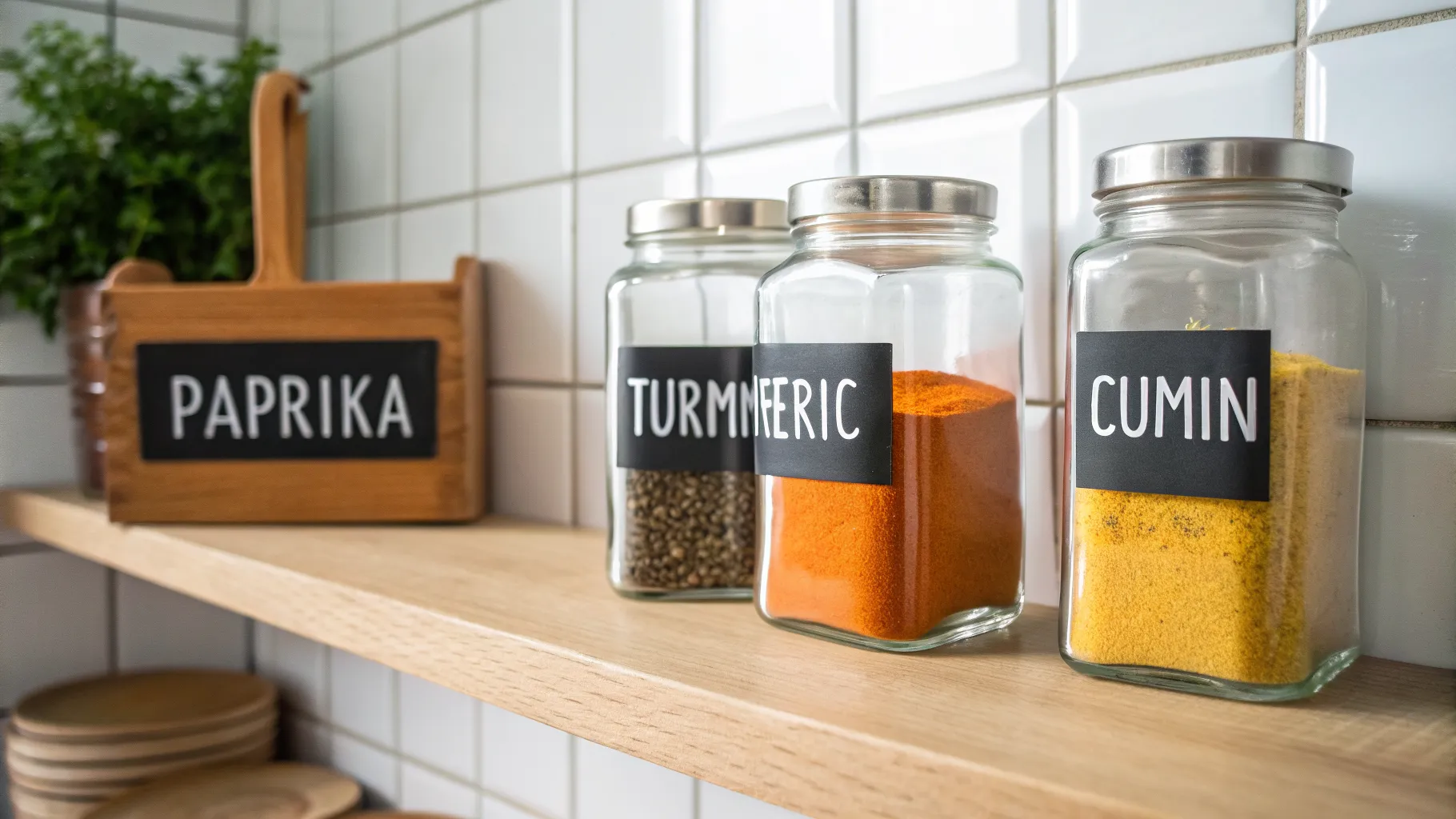
Choosing Your Medium: High Contrast Spice Jar Stickers vs. Erasable Markers
Once you have your typography principles down, the next step is choosing the application method. Pre-printed high contrast spice jar stickers are a popular and convenient option. They often come in sets with common spice names, professionally printed to ensure maximum clarity. Look for options with black text on a white background, or vice versa. These stickers offer durability and a uniform look across your entire collection. On the other hand, erasable food canister markers provide unparalleled flexibility. These markers, typically liquid chalk, allow you to create custom labels for less common ingredients or for canisters whose contents change frequently, like flour or sugar. When using erasable food canister markers, you can apply your knowledge of typography directly, creating large, bold lettering on a dark label or directly on a glass jar. The choice between static high contrast spice jar stickers and dynamic erasable food canister markers depends on your specific organizational needs and how often your pantry items rotate.
Empowering Independence: The Critical Role of Large Print Pantry Labels for Seniors
For older adults, maintaining independence in the kitchen is vital for quality of life. Vision changes are a natural part of aging, and small, cluttered text on commercial packaging can become a significant barrier. This is where implementing a system of large print pantry labels seniors can easily read becomes a transformative act. By re-labeling jars, canisters, and containers with clear, high-contrast, large-print text, you remove guesswork and reduce the risk of using the wrong ingredient. This simple organizational strategy fosters confidence and safety. When creating large print pantry labels seniors will use, ensure the font size is substantial—at least 18 points or larger—and that the labels are placed at a consistent, easy-to-see height on the shelf. This proactive approach to kitchen organization is a powerful tool for supporting aging in place, directly impacting daily well-being by making the kitchen a more accessible and less stressful environment. These large print pantry labels seniors are not just a convenience; they are an essential accessibility feature.
The Science of Perception: Understanding Visual Focus Container Labels
The effectiveness of high-contrast labels is rooted in the science of human vision. The principle of understanding visual focus container labels is about maximizing the luminance contrast—the difference in light reflected from a darker element (like text) and a lighter background. Our brains are wired to detect these differences easily. When contrast is high, the brain expends less effort to distinguish the shapes of letters, resulting in faster recognition and reduced eye strain. This is why the classic black-on-white or white-on-black combination is so effective. This process is central to understanding visual focus container labels. Moreover, a clean, uncluttered label design helps to create a clear 'figure-ground' relationship, where the text (the figure) pops out from its background. Avoiding busy patterns or low-contrast color pairings (like yellow on white or gray on black) is crucial for anyone dedicated to understanding visual focus container labels and creating a truly functional system.
Practical Steps to Implement High Contrast Labeling
Putting these principles into action is straightforward. Here are some actionable steps to overhaul your pantry for maximum visibility and ease of use, incorporating everything from an informative guide to low vision typography to the practical application of markers.
- Assess Your Inventory: Before you begin, take stock of all your jars and canisters. Decide which items need permanent labels, such as spices, and which might benefit from temporary ones, like bulk bin purchases.
- Select the Right Color Combination: Stick to the basics for maximum impact. Matte white labels with bold black text or matte black labels with bold white text are the gold standards. Avoid glossy finishes, which can create glare and reduce readability.
- Prioritize Font Simplicity and Size: Choose a clean, sans-serif font and make it large enough to be read from a short distance. Test a few sizes before committing to labeling your entire collection.
- Choose Your Labeling Tool: Decide between pre-made high contrast spice jar stickers for uniformity or a set of high-quality erasable food canister markers for flexibility. A combination of both may be the ideal solution for a diverse pantry.
- Maintain Consistency: Apply labels in the same position on every jar. This creates a predictable visual system, allowing the eye to quickly scan shelves and find what it needs without searching.
Frequently Asked Questions
What are the best colors for high contrast spice jar stickers?
The most effective color combinations for high contrast are pure black text on a pure white background, or pure white text on a pure black background. Yellow text on a black background also offers very high contrast. Avoid color combinations with low luminance contrast, such as green on red or blue on black, as they can be very difficult for many people to read.
How do erasable food canister markers work on different surfaces?
Erasable food canister markers, often liquid chalk, work best on non-porous surfaces like glass, plastic, or slate/chalkboard-style labels. They adhere well and provide a crisp, opaque line that is easy to read. To erase, you typically just need a damp cloth. They are less effective on porous surfaces like unfinished wood or some types of metal, as the ink can be absorbed and become difficult to remove completely.
Where can I find a good informative guide to low vision typography?
Excellent resources can be found from accessibility-focused organizations like the American Foundation for the Blind (AFB) or the UK's Royal National Institute of Blind People (RNIB). Additionally, web accessibility guidelines (WCAG) provide detailed, research-backed standards for digital text contrast and typography that are directly applicable to physical labels.
References
- The Principles of Universal Design - NC State University
- Web Content Accessibility Guidelines (WCAG) 2.1
- Vision and Aging: Common Eye Conditions - National Institute on Aging
- Typography and Readability for Low Vision Users
Authored by FreshLifeWire team